Thursday, January 26, 2012

A New Kitchen Planning Website

Pinned Image
via Cultivate
Photo By: Josh Savage Gibson and Eric Piasecki Designed By: Phoebe and Jim Howard
In case you haven't stumbled upon this new kitchen planning website, let me introduce you. It's called Cultivate. In my quest to finalize a couple of details for the kitchen, I came across one of Phoebe Howard's kitchens that I had not seen before (and it took me all of three seconds to fall in love with it) and it led me to Cultivate. The website had a certain feel that I liked and sort of recognized. I scrolled down to the bottom and  what do you know WSI (Williams-Sonoma Inc.) They sure know how to do things right! The format of the website has that Pottery Barn appearance. 

Pinned Image
via Cultivate
Photo By: Josh Savage Gibson and Eric Piasecki Designed By: Phoebe and Jim Howard

There is a Get Inspired tab that I clicked on and twelve good sized thumbnails popped up of kitchens and kitchen details. I noticed that there was a way to define your search by the style, the layout (ie. u-shapped, l-shaped, etc), the project cost, even cabinet and wall color. Pretty cool, right?

Pinned Image
via Cultivate
Photo By: Josh Savage Gibson and Eric Piasecki Designed By: Phoebe and Jim Howard 

You can even create an inspiration folder, keep track of your own projects and use the budget tools to plan a remodel.

Pinned Image
via Cultivate
I love the feel of all of these kitchens. It's the feel that my kitchen kind of had, that I'm trying to go all the way with. 

Pinned Image
via Cultivate
I was at a kitchen showroom the other day getting quotes on a couple of cabinets and I was explaining the look I am going for. She wasn't impressed. I knew she wouldn't be. I think her words were "it's been done". I was thinking that I know it's been done, I'm a designer, I've seen it a lot too but the thing is, as much as I've seen it- I still love it! To her credit, as we talked and got to know each other I think she realized that it's a good look for me (I mean our kitchen) it's classic, it's timeless, my husband likes it, the kids like it, 
- I hope you like it! 
I'll share my plans with you on Monday. 

Monday, January 23, 2012

"Ceilings Must Always Be Considered..."

"...They are the most neglected surface in the room."   
Albert Hadley  The Story Of America's Preeminent Interior Designer


Pinned Image
via

The ceiling ...aka the fifth wall-
 I have to tell you that I am one of those designers that is not conventional when it comes to ceilings. Flat, no sheen, white ceilings are never on my spec sheet (of course, unless, my dissertation on ceilings had no effect on the homeowner and they want it anyway) Personally, I like a little reflective sheen and usually a soft color or occasionally ...a lot of color. 

Have a look at some great spaces with not so average ceilings:

Pinned Image
Spinnaker Development via Decor Pad
Isn't this an amazing hall? 
The dark ceiling draws attention to the lighting and picks up on the dark floors and doors. 
This is not merely a pass through space!


Pinned Image
David Christesen via Decor Pad
The blue ceiling accentuates the crown molding and white cabinetry.


living rooms - Blue ceilings beadboard dark floors  Courtesy of House of Turquoise
House Of Torquoise
Painting the ceiling a lighter, cooler color will expand the space- making the room feel larger.


Lusas Allen Photography
via 

via


Style at Home
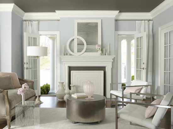
 It's hard to think of a ceiling as grounding a space but with the dark floor and what appears to be the same gray on the fireplace surround, the room feels balanced.

via

All of these spaces so far I wouldn't consider eccentric or theatrical- those are a little further down. The point that I wanted to make is to consider a color. Often the ceiling is the largest surface in a room- make it count!

via


Okay, here's where it gets crazy


...and in this space- in a fun and classy way!


Pinned Image
via
Kids rooms are great rooms to have at it with the ceiling. 
Kids love it! 

Pinned Image
via

Pinned Image
via

Pinned Image
via


Sometimes even grown ups like brightly colored ceilings!

Pinned Image
Source Unknown

Pinned Image
via

via
Hope you are having a great start to the week. I'm off to run on this 50 degree rainy day in CNY! Honestly, I think this so called winter will go down in history as one of the weirdest!

Do you have any special ceilings in your home?

Friday, January 20, 2012

DIY Home Decor You Have To See To Believe

DIY stencil throw pillow
Wit & Whistle
DIY Stencil Pillow
What do you think of when you hear DIY home decor? 
If you think it means blood sweat and tears or crafty looking picture frames made out of Popsicle sticks, I'm here to change your mind. I have put together a collection of tutorials that give step by step instructions to make some really beautiful home decor. I think you will agree that many of these items do not look "DIY". You'll want to try these!


Pinned Image
via
DIY Drum Pendant light
A very chic drum pendant light made from two embroidery hoops, sheet plexiglass and fabric. 


Pinned Image
via
DIY Gilded Branch
A really sophisticated look that really doesn't need a tutorial. Spray paint a branch! 
 How beautiful would this be as centerpieces at a wedding with a couple of lovebirds perched on it?


Pinned Image
via
DIY Wall Decor
I love this idea and will definitely be trying this one. Wood letters are glued to canvas and spray painted. Think of the possibilities!


Pinned Image
via
I will admit that this is not as easy as spraying a branch but with a little determination you could make this light. 
You can't flip through a home decor magazine without seeing these lights and using some wood beads and a hanging flower planter you could make one for yourself!

 
Pinned Image
via
DIY Concrete Bookend
Such an understated look! 
There is not one thing I'm posting that I'm not planning on making- I can't wait to share 
- my wheels are spinning!


Pinned Image
via
DIY Tassels
Tassels made from a champagne cork and pages from a vintage textbook. So clever!


Pinned Image
via
DIY Wine Bottle Chandelier
From the cork to the bottle- a wine bottle chandelier. 


Pinned Image
via
DIY Decorative Wall Panels
This is something that I've always wanted to do.  We have a very high ceiling in our foyer and I know that I don't want to get up there and paint or paper something decorative on the wall. Wouldn't something like this be cool? I like the idea of not committing to one look for a long time and with these lightweight panels (foam insulation board) covered in fabric I could change it from time to time.

Are you convinced? Do you think you may try one of these?

Check out my Pinterest Handmade Gifts and Decor board to see all of the ideas I've collected.

Tuesday, January 17, 2012

Recycled Re-Purpose Refurbish

Pinned Image
via
Tuesday already? What a weekend! Thank you for all of the well wishes after last Friday's post. 

Well, I really didn't plan on gutting the kitchen but essentially that's what happened over the weekend. Water is an amazing thing isn't it? It is hard to fathom the amount of damage (and upheaval of life) that people who have had flooded homes must endure. We had one little pipe, with one little hole and we are looking at a nearly gutted kitchen. Unbelievable! 

Of course, I'll post all about it soon enough and of course, I will be taking advantage of having everything torn out. We will be putting it back together a little differently- adding some recessed and pendant lights, changing the wall color, etc. The footprint hasn't changed so I won't get that pantry I joked about on Friday but I will be working on some creative storage ideas.

4-1-08-repurposed-pulls.jpg
bhg.com
As I was searching for some inspiration, I found a lot of very unusual and unique ideas for displaying and storing items, using recycled or refurbished vintage items.

Pinned Image
via

Some of it is kind of silly and not very practical but in the right place adding one or two of these ideas to your home decor could be quite charming.


Pinned Image
Design Sponge
It would be so easy to add legs to an old vintage suitcase. 
At the end of a bed, besides being a place to sit, it could hold some extra blankets. 
How cute would that be in a guestroom?


Pinned Image
via
A Timeless Tufted Tub!


Pinned Image
Design Sponge
How about using an old door to make a couch...


Pinned Image


...Or as a backdrop, with a mounted sconce...
{Gorgeous!}


Pinned Image

Or as a table top- {I really like this one too}!


Pinned Image
via
This is so clever- what an amazing collection of teapots!


Pinned Image
Twig Home
And who doesn't want to hang their pearls from an old rusty rake... The contrast does create some drama! Actually, the idea of using a rake for display purposes is pretty interesting. How about in a rustic bathroom with little bouquets of dried lavender?


via
This is awesome! 
Don't throw the boat away- recycle it- bring it in the house, hang it from the rafters!
Sleep, swing, or just daydream

Lots of fun ideas.
Which was your favorite?

Friday, January 13, 2012

Just Another Friday The Thirteenth

Today I was going to do post about my one year anniversary. Yes, exactly one year ago today Ispirato Design Blog went live on the internet! 


I will save that post until next week because when I woke up this morning, this Friday the 13th morning, I could hear what sounded like pouring rain coming from my kitchen. To my dismay, that was a pretty accurate guess. A pipe burst in the kitchen ceiling and the kitchen was completely flooded. My husband and I have spent the entire day tearing down sheet rock, moldings, emptying out and removing wall cabinets- pretty much gutting the kitchen. We have no water. I'm missing one of my best friend's mother's wake that is going on right now because I'm waiting for Servepro to come and help deal with the water damage. Did I mention that the kids had a snow day today because we are in the middle of a blizzard and my son is stuck in Buffalo! 

Other than that, life is good and I can't even take myself seriously trying to get all worked up because I only need think about those who are dealing with real disasters, life and death disasters and I count my many, many blessings. 

Happy Friday the 13th- Really! :)

PS. Maybe I can work a pantry into the re-do! teehee

Wednesday, January 11, 2012

Piano Room Update

Finally, I can share with you a couple of "finds" that I have found and at the same time, give you an update on the piano room. 

By the way, I hate calling it the piano room- 
same as I don't like calling the family room, the TV room. I've tried music room, sitting room- they sound so foo foo! In traditional terms, I think it would be called a parlor but can you imagine me trying to get the family to go along with that- not happening. 
Any ideas?

Any how, so often bloggers are showing off their bargain finds from flea markets and salvage shops and I've been wanting to get out and do that kind of shopping more. I used to go to auctions and antique shows all of the time but not so much recently so thank you fellow bloggers for inspiring me with all of your great finds!
It's my turn!


Isn't it GORGEOUS! ...and there was a PAIR. It was love at first sight when I saw the pair, no shades, just wrapped up in the cords. Then I picked one up and knew I had to have them- they are so heavy! 
We are not talking Lucite here.


Just perfect for the console table in the piano room.


 I picked up the console table years ago at a house sale. I painted it black and I've thought about changing out the mirror top- It has kind of a dated smokey finish but I've learned to like it and the glam period it represents.


I put my redesigned stool underneath so that it can be pulled up to the table for extra seating. I like that it grounds the console table but I've had my eyes on a pair of these ottomans:

Ballard Designs
I'm thinking something more solid would work better under the table.


My husband just cut a seat out of plywood so that I can reupholster my other stool with matching fabric. I wanted the additional thickness because I would like to put nailhead trim around the edge. 
You know- my favorite bling!


At the same place I found the lamps, I also saw this hanging lamp. I mentioned that I loved it to my mom and to my husband. I was pretty sure one of them would get it for me and my mom did- apparently the hubster tried but my mother offered more money. They really should communicate better!


Of course, I had to take it apart and give it a little of it's own bling- 
A gold interior.


I used Rub n Buff on the inside (Grecian Gold).


I had to paint the outside since my gold spread a bit. I painted it the same white as the furniture.


More Rub n Buff on the hardware.


Doesn't it make a huge difference?
The piece on the left is done, the one on the right is not.


Not a huge fan of the swagged chain but at least I could make it look better. I used Rub n Buff on the chain as well- it just gets rid of the icky gold and gives it a buffed gold look. 


Now an update on the piano. I AM GOING TO PAINT IT! I mean it this time. I have an entire board on my Pinterest devoted to pianos. It's been such a hard decision. I think you are going to like my idea- I know Miles Redd would! The final decision is Farrow and Balls Hauge Blue. You know the one. Here's the now famous Miles Redd kitchen:


Gosh, isn't that a gorgeous color! At a hundred bucks a gallon it should be! 


I have a feeling that the F&B swatch is going to be almost black. I've picked what I think is a similar color from my C2 fandeck but I'll wait to get my F&B sample to make up my mind on the brand that I will use.  
I'll keep you posted- so to speak :)

PS- I'm waiting on a quote from the upholsterer regarding the furniture- I'll keep you posted on that as well.