Tuesday, August 30, 2011

Progress On The Re-design!

The settee and chair will be painted and re-upholstered.
{See yesterday's post}

Posting two days in a row- you must know I'm excited.
 Look at what I re-discovered!
We've had this picture (below) for so long- I remember we bought it for about twenty bucks at an auction. It's been in a garbage bag in our garage. I knew I would use it someday! 


It is going to be perfect over the settee. It's a little off center- I was so excited to get it up I just hung it on an existing nail. The painting (I should say faux painting-it's not a real painting) actually looks good, as far as the colors go, but I will just use the frame and do my own painting. 


I'm not sure what color I'll paint the frame but I'll most likely leave the blue accent.


I also wanted to show you how I decided to handle the large cocktail table. 
Remember the lazy susan that I refurbished (HERE)? I decided to use it right in the middle of the table to break up the expanse of the wood tabletop. The white finish and nailhead trim give it the bling it needed!


It also gives me a place to display some of those blue and white accessories I was telling you about. I can't wait to decorate it for Christmas. Well I can, but I can't- you know what I mean :)

Yesterday when I was talking about the design process, I failed to mention one thing and it's a biggie, like my trademark big! The first thing I ALWAYS do in a re-design is imagine the room naked. 
That's right- with nothing in it!
The next thing I do is ask myself this question- How does it look "architecturally". I love modern touches/furnishings for sure but FIRST I love the room to have classical architectural features. I have found that most people here in the northeast do as well. What do the moldings look like?- Can we beef them up? Are there built-ins?- Can we find a place for one? I think the room should be interesting and have character without anything in it. That's the backdrop that will MAKE the room!

I'll show you some ways to do that on an upcoming post.

Tomorrow is the last day for the Ramsign give-away!
Ramsign House Number Give Away going on HERE


Monday, August 29, 2011

Redesigning the Dining Room: An Update

Tina, at The Enchanted Home, recently featured a fun site for creating mood boards. It's called Olioboard (olioboard.com) and even though I usually use Picassa and Microsoft Publisher for creating boards, mosaics and collages, I thought I would give it a try. I liked it- it was really fun and easy to use. I'm not sure which program I like best- they each have their positives and negatives.
Try it out and see what you think- it's not just for designers!

Some ideas for the new music room!

I decided to use the olioboard site to give you an update on where I am with the dining to music room conversion. The last time I posted about this, I had just moved the dining furniture out and the "new" old furniture in. That's where it is still. I knew I wouldn't get much done over the summer but with fall looming, I'm feeling like I need a plan!

Next, I'll break down the mood board and I really would like to hear your feedback. 
Also, as I redesign this room, I will detail the general process.

This is a detail of the border.
The oriental rug is my jumping off point (aka the inspiration piece).
It's a 9x13 Tabriz and predominately deep red. The border has cream, black, olive, orange, a lot of purple and a beautiful blue. It's the blue that I would like to use in the room as a primary color. I have collected a lot of blue and white accessories throughout the years so pulling the blue out is a logical choice. 
The adjacent room (the foyer) is blue-gray. I like when colors flow from one room to another and my rooms are not that big, so in my case, it's essential.

STEP ONE: 
Find your inspiration piece. It could be a rug, a painting, a fabric that you would like to use, ...just about anything can be used as an inspiration piece when you are starting from scratch! 


Music Room Floor Plan

STEP TWO: 
I have collected pieces of furniture throughout the years that I liked and knew that I would use someday. Some of it needs to be refinished.... so, the next step for me was to figure out what furniture I would be using and how it would be arranged. The pieces in the above plan that are labeled, are the pieces that I really, really wanted to use. 
The cocktail table is large but here's my rational for using it: 
1.) it's a Russell Wright table that goes with the Russell Wright buffet and mirror- I like that the wood tones are the same, I think it connects the two areas.  
2.) We like to play board games -we need a table that is large enough to function for that purpose and
3.) I no longer have a "dining room" and when we entertain (about 25-30 people for every birthday and holiday) I can see the kiddies sitting around this table- Japanese style! It will work and I like it. 

Here's a side note- if you like the way something looks or the way a room feels- throw out the design rules!
 I mean seriously, it's your home, right?

Now on to the furniture! 
Wisteria
Wisteria sells a caned chair very similar to the one that I have. Black painted finish, cream upholstery- I like it. My rug is busy and I'm not big on mixing a lot of colorful patterns. 
Here's my chair:

This will be the "before" pic.
I've never reupholstered anything so this will be a first!
Also, I like change. By keeping the upholstery neutral I'm free to change the look of the room by switching out pillows, throws and accessories.

With that said- have you seen this couch?


This is the inspiration for the settee (see the pic below). You will have to use your imagination a whole lot but this is how I want to upholster the settee cushion.

Another re-upholstery job and I'll add bolster cushions
along the back in order to carry the color up the back a bit.

http://www.beddingsheetsandlinens.com/products/view.aspx?family=714509&rmk=1833

...and the zebra print pillow- gotta have it!


The Russell Wright buffet will serve as a much needed storage piece and also a hub for the phone and a few desk accessories. 


I think I will use this chair. It's light and can be easily pulled up to the table. I'll be looking for a fun fabric to use as a cushion or pillow- I may even paint it. What do you think?

As far as wall color- I need to repaint. I like the blue/cream combo that I have but I'm considering a brighter white for the wainscot -just to freshen the room up a bit.

Any other ideas?

Friday, August 26, 2011

Fun Friday Find: Have chair- Will Travel!

Is it Friday already- seriously!? WOW!
Sorry I've been AWOL but...

I got one of those calls that mother's don't like to get. As soon as I saw my daughter's college roommate's number on my caller ID my heart skipped a beat and then when the first words were "Mrs. Samoraj, Jacqueline is okay but...we're at the hospital". UGH! All of the mothers know the feeling I had. 
Long story short- She was in a Strategic Planning Business class and as part of a "team building" exercise she fell and broke one elbow and severely hurt the other so that both of her arms are splinted at ninety degree angles, making it impossible for her to do such things as eat, get dressed, itch her nose, etc, etc. She looks like a human Rock 'em Sock 'em Robot. She definitely needed some mommy TLC!

You have to admit -that's a good reason for not blogging!


I've been saving this image for a Fun Friday! I just fell in love with this chair- It's fun and stylish- a combination that isn't always easy to find. This could go on the DIY to-do list! 
Don't you love it!?

I know one image is lame but I'll be back at it next week! Have a great weekend!!!!


Monday, August 22, 2011

The Monday Mix: Fashion and Decor

Hi everyone, Welcome to the ninth installment of the Monday Mix. This one will be a quickie because as I explained last week- I'm running out of ideas ...and images. 

Today's Monday Mix: Bathing Suits and Decor

Completely Coastal
So there it is, my one and only image but such a fun idea! 
Vintage bathing suits framed and used as art. How fun for a coastal home or summer house!

Friday, August 19, 2011

Fun Friday Find: A Penny Floor and Gift


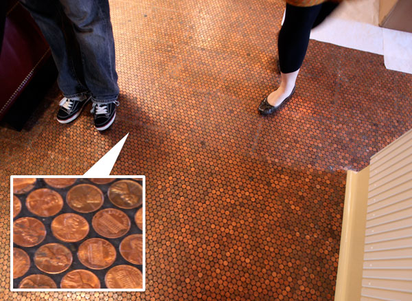
The Standard Grill is located in the Standard Hotel in New York City. It's situated under the High Line along with a lot of other trendy eateries but this place has a very unusual feature.


pennies2.jpg

A floor made of pennies! 
How cool is that! (I mean how FUN is that!) 


pennies.jpg

I showed this image to my son and he was so impressed that he and his brother used it for inspiration to make me a birthday gift. Check it out at the end of the post... they are so cute! 


Besides having a wicked cool floor they have a very stylish restaurant!


I love the floor tile, as well as the tables and chairs, in this area.


Looks like a nice place to eat- have you been here? 
I'd love to hear your reviews!

Now for a little penny inspired gift:

A wall hanging (minus the hangers) from my youngest two, Dominic and Vincent!
Thanks kiddos :)

...And Don't Forget! 
I've got two great Give-Aways going on now!

Pet Portrait Give Away going on HERE
Ramsign House Number Give Away going on HERE

Tuesday, August 16, 2011

A Secret Passage

Turquoise Tulips and Bliss

I've always wanted a secret passage into a secret room. I know- who hasn't? I'm not letting it go though. I'm convinced that I have the perfect spot for one! 


Ruth Burts Interiors

Noo, I'm not going to show you a picture of it because that would mean cleaning and it's late! I have to work in the morning and then drive my daughter back to college. Sniff, sniff :( but trust me -It's the perfect spot. It's in the upstairs hall where I built (yes me- all by myself) floor to ceiling bookcases right down the hall- around my daughter's bedroom door. I always thought -Wouldn't it be cool if Jacqueline's door was part of the bookcase? Her bedroom would be a "secret room"! 


woodfold-bookcase-doors.jpg


Soo, it's on the to-do list. I've been thinking a lot about that to-do list lately. Not one thing got checked off from it this summer- it's been a struggle just to maintain things but I'm looking forward to getting back at it this fall. I've got the dining room makeover which will include many small projects, painting the foyer and of course the secret passage!


Real Simple


I know they make special door hinges for this type of project. A bookcase can get quite heavy.


Hidden door ?!?
Central City Millworks

(via fuckyeahbookshelves)
hidden door leading to a room filled with books = life goal
via

This is what I want mine to look like. They are painted white and have a simple crown molding.


via
Aren't these fantastic?! Tell me- have you ever thought of doing this?
Monday, August 15, 2011

The Monday Mix: Fashion and Decor

dabble magazine
via

Welcome to the eighth installment of The Monday Mix! This has been such a fun series but frankly I am running out of ideas. I've got one more for next week and then I think I'll do a "Best Of" just so that I can eek out a tenth installment and appease my obsession over even numbers! If you have any other ideas I would love to hear them!
The Monday Mixes so far are:


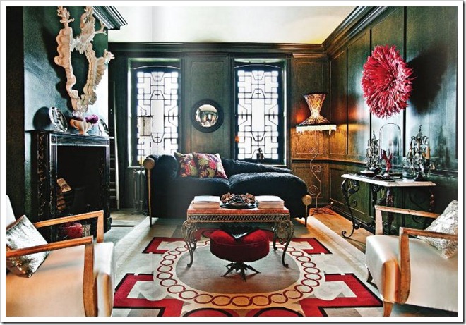
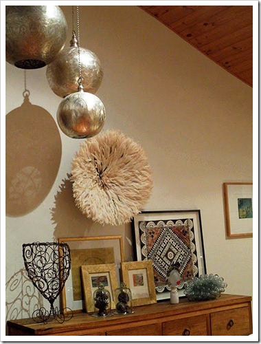
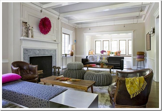
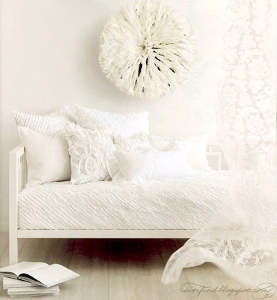
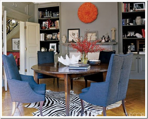
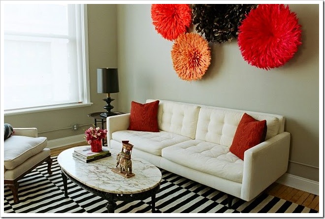
Today's Monday Mix: Juju Hats and Decor

That's right I said juju hat! Have you ever heard of them? I had never heard of them but now that I know about them I see them everywhere.  


Here they are used as wall decor:

table tonic
via
Originally they were made of red parrot feathers and worn by African royalty chiefs or prominent members of African society during royal affairs, weddings or funerals.


via
There is actually an intricately woven basket structure on the underside. Palm leaves tipped with a feather are inserted into that structure and the outer palms are covered with silk. 


via
Besides being worn by established men in the community they were also worn by Juju dancers. 


scoutdesignsnyc via table tonic
via


via


via


via


desire to inspire
via


via


via
Would a juju hat fit in with your decor?

...And Don't Forget! 
I've got two great Give-Aways going on now!
Pet Portrait Give Away going on HERE
Remsign House Number Give Away going on HERE

Thursday, August 11, 2011

House Number Plaque Give Away

Highlander Style

Classic Enamel Signs- Handcrafted by Ramsign

Danish sign maker Ramsign is generously offering the readers of Ispirato Design blog a chance to win a personalized house number plaque. The winner of this give away will be able to choose one of five different designs and up to five digits. 

Metropolitan Style
The blue porcelain enamel house numbers and name plaques are often referred to as "french house signs". I just love these!
Visit Ramsign to see all of their handcrafted products.


Engelhardt Style
Though the blue and white Metropolitan style is my favorite, I would probably choose the understated Engelhardt style for my own home.


Highlander Style
There are five styles to choose from-
Which is your favorite?


Engelhardt Style

Metropolitan Style

Arrowhead Style

Lighthouse Style

To Enter :
Be a follower of this blog and leave a comment at the end of this post telling me that you are.

For a second entry:
Visit Ramsign. Come back and in a second comment, tell me what your favorite style is.

For a third entry:
Tweet or post about this give away and leave me a third comment letting me know that you did. Be sure to include this link: 

I'll choose a winner August 31st via random.org
(I'll be choosing a random number for this give away so be sure to leave separate comments for each entry.) Also, be sure that your comment links to your email or leave me an email address in your comment. 
Ramsign will be notifying the winner to make arrangements. 
Shipping is free and the Give Away is open to readers worldwide!

Thank you to the folks at Ramsign- Good luck!