Tuesday, May 31, 2011

A Tour of a D.C. Townhouse

Photographer: Simon Upton

This little snippet of a picture caught my eye because of the settee in the foreground. It reminds me very much of the settee I just put into the new music room (below). 


Mine is more curvy but it has the caned back and sides. I am really digging the the white finish and the grayish upholstery!
 I'm almost committed to starting that project- almost :)

Anyhow- Nice room, right?

This D.C. townhouse was featured in Elle Decor a few years back. It belongs to furniture designer and decorator Darryl Carter. 


Same room- different perspective. 
Great example of opposing forces: an eighteenth century regency table alongside polished-poured-concrete cocktail tables!


Carter designed the mantel himself. As I sit here by the pool writing this post it is hard for me to think of a roaring fire in that fireplace but I can envision the kids lined up on the bench with a mug of hot chocolate. 


An antique Italian etagere sitting up on the countertop accentuates the height of the ceiling over the island.


Another concrete table in the dining room. 
The chairs, designed by Carter have Edelman leather upholstery.


I appreciate the modern lines of the concrete table but definitely prefer this rustic table in the breakfast room.


More antique eighteenth century furniture and shutters designed by Carter. 
What a luxury to have a pair of antique tubs 
(salvaged from the Russian Embassy no less)!


I have to show you the master bedroom. 
A pair of bordello doors serve as the headboard- 
I'm trying to think of something pithy to say but nothing is coming to mind ;)
 I'll just leave it at that! -Love the rug!
Have anything to add? I'd love to hear from you!

Wednesday, May 25, 2011

Painted Wrought Iron Furniture

via

Time to paint the iron furniture on the deck! 
This is going to be a quick post- I'm headed out the door and I need to decide what color I'm going to paint the wrought iron furniture this weekend. 

Here is some inspiration if you are also tackling this project:

French Grey Outdoor Heart Chairs - Set of 2
via
French gray is lovely and I am considering this.

via
At one point I had this aqua color. 


Iron Patio Furniture
via

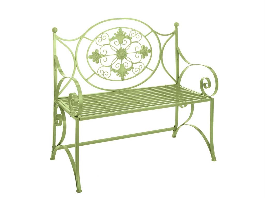
I love the navy- especially in combination with the green bench below.

via

via

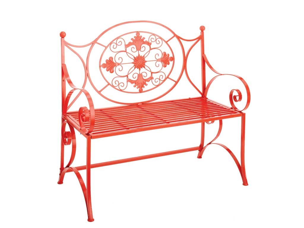
Both the green and the red are so vibrant and fun!

via
Some of the furniture I have  is black with black and white stripped cushions- I love traditional black wrought iron! Those will just get a fresh coat of paint.
If only I had a few of these chairs- they are classic and so comfortable! 
Have you ever sat in one?

via
This is it- this is the color I'm going for! 
Turquoise :)

via
I suppose I could just let the furniture weather.
 I do like the look but not on a deck.

via
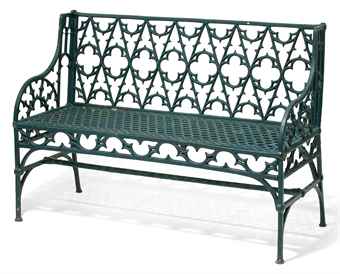
I think this bench would look beautiful in any color. 
Isn't it beautiful in white though?

Hopefully, by next week I'll  be able to show you the finished project!

Which one is your favorite?

Monday, May 23, 2011

Vinyl Flooring- Really? YES!

Mannington Adura Luxury Vinyl Planks

Currently, I am working on a doctors office- it's 4000 sq feet with the usual spaces: waiting, reception, exam rooms, doctor's offices, toilet rooms, break room etc. There are three types of flooring- carpet, ceramic and vinyl, that will be used. I was looking for some vinyl tile design inspiration (vinyl will be used in all of the exam rooms, procedure rooms and lab) and I not only found the inspiration I was looking for, as far as a pattern goes, but also inspiration for todays post. 

Let's look at vinyl for residential use.


Sigma Vinyl Tile
Vinyl tile for the home has come a long way! Some vinyl tile manufactures (ie. Mannington and Armstrong) are making a luxury vinyl flooring line that not only looks like wood, tile and stone but also feels like it. 
Two huge benefits are the ease of care and the price.

Sharon Montross Home via Apartment Therapy
VCT (vinyl composite tile) is easy to install, it can be installed virtually anywhere and to maintain it you just need to wipe with a damp mop.

Kristie Barnett from of The Decorologist explains that this kitchen floor consists of six colors of twelve inch VCT cut in half and arranged in a random pattern. What a great look!

ArmstrongLuxVinyl
Armstrong  Vinyl plank

Luxury vinyl plank flooring comes in long pieces, textured to mimic wood and are  installed in a staggered pattern just like a real hardwood floor. These are not like the thin peel and stick tiles that you get at big box stores but they are less expensive and easier to install than hardwood.
Tarkett
What about sheet vinyl you ask?! 
Well, Fiber Floor by Tarkett is a sheet vinyl that comes in a variety of vibrant colors, funky patterns and even some very realistic stone and wood patterns.

kidfloor6.jpg
Tarkett
A children's play room is the perfect application -and get this...Fiberfloor sheet vinyl is not only thick and cushioney, it can be installed as a floating floor covering! No glue or adhesive- just some shoe molding around the perimeter.

14311-Funtastic-Island_Multicolor-4CHR
Another one from Tarkett
 So when the kids grow out of the design or you are ready to upgrade- just roll it up!

Tarkett
I really was surprised to find so many options for sheet vinyl!

Tarkett
This picture cracks me up but I guess it makes the point...vinyl is water proof! Since the sheets are twelve feet wide, it often can be installed without a seam.

elle decor 300x300 Frugal Kitchen Flooring
Elle Decor
To finish, the classic black and white checkerboard pattern- always so stylish!

If you had a negative perception of vinyl, have I changed your mind about it? 
Vinyl has a place in residential design! Don't you agree?

Friday, May 20, 2011

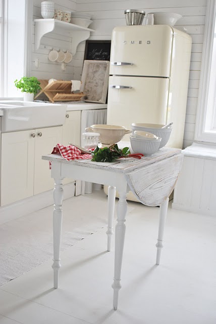
Fun Friday Find: SMEG Refrigerators

So what do you know about SMEG refrigerators? 

Did you know that SMEG is an acronym for Smalterie Metallurgiche Emiliane Guastalla (a metal enameling factory) in the village of Guastella, Reggio Emilia, Italy. 
Really, you didn't know? Neither did I :) SMEG refrigerators are made in Italy.
I just did a little research- very little, this is more fun than informative- you know, just a little eye candy! 

via
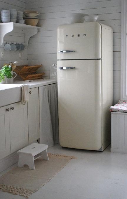
Some of the styles are real throw backs- You have to open the refrigerator in order to get to the small box freezer inside.


Some have separate freezers.

House Beautiful
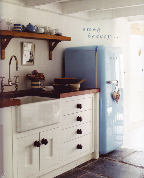
The colors are just amazing.
They are also available with very striking graphics. 

Home Inspiration
Sears, here in the states,  carries a single design-  the one with a 3/4 cu. ft. freezer compartment inside the refrigerator. They sell for $2099.  For a 9.2  cu. ft. refrigerator, that's on the high end but this refrigerator is about style!


Provisions-MW-Retail
Provisions, Singapore

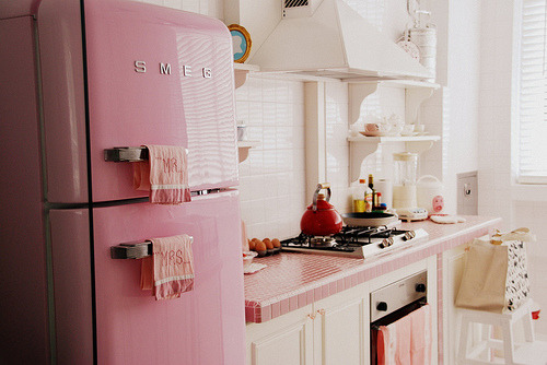
You have to admit that a pink refrigerator is pretty fun :)

via
Apartment Therapy


I will always reblog smeg refrigerators.  Always.
My Ideal Home


So What do you think? 

SMEG news: ACE Hotels
via
They can be serious, modern, even sophisticated....

Good enough to eat
Kitchen Clarity
But I think they are mostly nostalgic, retro and just plain fun!
Where would you put a SMEG refrigerator?

Have a great weekend!

Wednesday, May 18, 2011

Featured Designer: Greg Natale

This truly famous interior designer is based in Australia. 
A designer extraordinaire of residential, retail and commercial spaces. 
I've only chosen a sampling of his residential interior spaces but you really must have a look at his entire portfolio found HERE!


I've had this photo in my "foyer inspiration folder" for a while. 
This is where I'm headed!


Is this sun room not gorgeous!


There are some designers who intentionally do something unexpected in every space- it becomes their trademark. Greg Natale seems so focused, almost as if he has a design formula that he follows and does not waiver from. I think this approach is why his interiors are so dramatic (and to me- awe inspiring, I am not that disciplined when it comes to design).


DRAMA!


Just plain pretty :)


Now we have moved onto a different house. This house is similar in many aspects to the first. He does have homes in his portfolio that are filled with color- these first two homes just make me a little weak in the knees
- don't be jealous honey!


If you know me at all, you know I LOVE this! 
Super modern cocktail table, traditional rug, black walls...very cool.


What do you think of using a wall covering to accent just a few walls, a single wall or even part of a wall?


He uses what appears to be the same wall covering, in different colors, throughout. In this house, he did the same thing with the tile in the bathrooms...same tile, installed in the same distinctive pattern but a different color for each bath room.


Again, a similar wall covering but in baby blue
- it becomes the perfect nursery accent wall! 
Do you see what I'm talking about? It's a design "formula". 
On his website, if you look at all of the rooms in this house, you will see how effortlessly one room flows into the next, yet at the same time, each room possesses a distinctive mood, provoked by the color choice. 


I could frame this photo... A beautiful composition!


Are you sick of me saying "I love, I love"- allow me one more time :)
I love the white cabinet! It makes me want to saw the legs off from my Russell Wright buffet, paint it white and mount it on the wall.


I love I am so fond of the white "vintagey" bed with that awesome green velvet paired with the equally "vintagey" gold chair and equally awesome green and white fabric. 


 This is just fun, right?


Some inspiration for all of you that like to paint vintage furniture and give it an updated upholstery.

So what do you think? Forgive me if I sound like his agent- just every now and then you find a designer that strikes a nerve- Anyone else feel this way about Greg Natale?