Friday, April 29, 2011

Bling It Baby!

When you think of nailhead trim, do you think of drawing rooms and studies with Chesterfield sofas and leather wingback chairs. Not me! I think of it as traditional style bling. It's part of that perfect harmony, the style I so love- using a traditional detail in a modern way.

My favorite border pattern made better!

Traditional Home
Just a little here and there adds an enormous amount of flair!

Decor pad
It's a sexy little detail!

Graham and Green
It's the finishing touch- like adding that perfect piece of jewelery to an outfit.

Gryphon 
Nailhead trim detail jacket from Gryphon - New York. Cute, cute, cute!
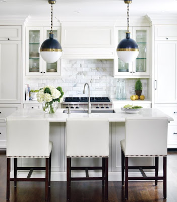
A little goes a long way.


dens/libraries/offices - Baker Chair blue velvet chair nailhead trim glossy white lacquer desk baby blue porcelain gourd lamp brown grasscloth wallpaper brown turquoise blue bedroom
Designer: David Brian Sanders via Traditional Home
Photograph: Joe Schmelzer; 
What else is left to say?

modern living room
Hayes De Fer via Decorati
I was so inspired by these pictures. It gave me an idea (one of those epiphany's)! I have an old lazy Susan that needed a little pizazz. Here she is in her doldrum (that's a word, right?) finish.  A dear family member made this and for that reason alone I do like it, also, it's useful when you have a family of six sitting down for dinner.


Feeling a little bad, I pulled off the little handles. I'm sure that took a considerable amount of patience to build. 


I filled the holes and sanded it down.


I painted it and gave it some bling with french natural nail head trim.


La Di Da! -Lazy Susan is now Lazy, but hip Susie!! 
I liked this so much, I'm making eight of them for my Etsy shop, I.Design Marketplace. It's the first of an entire line of home decor and gifts that I've been working on. I will keep you updated when I add new items.

Here's an update on the dining room conversion:
It's officially not a dining room. The dining furniture is out and for sale! Take a look at it HERE. As you will see it's painted (walnut wood) and I would be willing to re-paint it to suit your needs if any of the local people are interested. I'm reluctant to show you all of the furniture that I pulled out of the basement, but I will. I want to give you an idea where I'm going with this. Please chime in with your thoughts! Doing this room has opened a can of worms as far as projects go because I'm determined to use mostly what I have and spend as little money as possible.


Mid-century Russell Wright sideboard and mirror (stays as is), rattan chair and matching settee will be painted a lighter color with a solid upholstery (like the deep blue that's in the rug) and graphic print pillows (like zebra). I'm leaning toward painting the piano gray. Table lamps will be touched up and I will be showing you how to make new lampshades.


Here is the matching settee that will also be painted a lighter color and reupholstered in a darker fabric and I will be adding some nailhead trim along the front panel. The Russell Wight cocktail table is large (not as large as it looks in this picture) and sturdy. You could dance on it if you felt so inclined but we will use it mostly for board games! I like that the bench works as part of the seating arrangement as well as for playing the piano and there is a small Russell Wright chair and footstool in the corner (bottom right) that can be pulled up to the table.  Ignore the stuff on the walls-just playing around with different ideas. Can you picture it?  Wondering where the books are going since it was supposed to be a library? Well, one of the other sitting rooms, the one with the existing fireplace and built-in bookcases, is going in that direction- I'm telling you, catch 22. We're having fun with it and that's what it's about! 

I'll leave you with this:
"Make your home as attractive and comfortable as possible and then get on with living. There's more to life than decorating."
--Albert Hadley
Have a great weekend, Michelle :)


I'm sharing my Lazy Susan makeover with:


Primitive & Proper Piece of Work Wednesday

and
Debbiedoo's blogging and blabbing
Debbiedoos
and Metamorphosis Monday on Between Naps on the Porch


and Amaze Me Mondays on Dittle Dattle
Dittle Dattle


and Motivate me Monday on Keeping it Simple
Keeping It Simple


 http://linda-coastalcharm.blogspot.com/
Coastal Charm

Monday, April 25, 2011

The Iconic Bentwood Chair


Sara Ruffin Costello's (editor of Domino) living room/dining room.

Did you have a nice weekend? I sure hope so! 
I'm still obsessing a bit about the new (soon to be) study. I've decided not to paint or do anything structural -it's pretty much pulling pieces of furniture out of storage and other rooms in the house and arranging them. I'm considering using some bentwood chairs that we've been storing because they are small and light.


Spray painting them black would certainly be easy and I like the look.

Source
Bentwood chairs have been around since the early eighteen hundreds when Michel Thonet invented them. 

Source
Thonet was a German, living in Vienna, when he created the bentwood process: soaking, steaming, bending and molding wood into various shapes.

Source
Most of the bentwood seen in the eighteenth century was manufactured in France, Austria and Poland.

Source
In 1870, when Thonet's patent expired, several other companies went into production making bentwood chairs. One of those companies was Mundus and Kohn. Eventually the companies merged and are still in existence today as Thonet Company.

Source
 Speaking of the armchair version, (above) the celebrated 20th century architect Le Corbusier stated "Never has anything been created more elegant and better in its conception, more precise in its execution, and more excellently functional."

Elle Decor
The iconic No 14 chair is still manufactured today as the No. 214 chair. It consist of six pieces. The design has remained unchanged for nearly 150 years.

Source
Often referred to as the bistro chair, it has become the most influential design in the history of furniture. 

Decor Pad
Of all of the finishes that I've seen, this is the one that I favor most.

Apartment Therapy

I love the chairs paired with the Saarinen's modern tulip table.

Source
Muriel Brandolini’s Upper East Side townhouse.

Source

Sources and Excerpts: Lennonhall Antiques ,  Patrick Taylor,  EBay Guides

It's estimated that Thonet chairs have seated more people than any other chair in history? It is amazing to me how timeless this chair is! I like to try and think about what new piece of furniture will stand the test of time like Thonet's No.14. Will there ever be one? Any ideas?

Be sure to sign up for the Pet Portrait Give Away!
Win a Gift Certificate for a Pet PortraiT

Wednesday, April 20, 2011

Music Rooms

Isn't this whimsical?
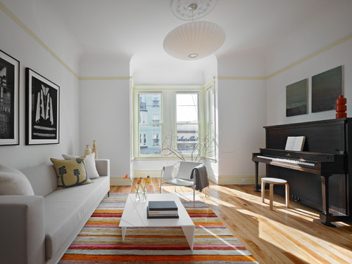
It's so fun thinking about completely changing a room. After getting the piano, and deciding to ditch the dining room for a library/study, I've been searching the internet for pictures of rooms with pianos. I'm looking for inspiration! Here is what I found:

London Neo-Gothic Islington House Living Area Design
Barbara Weiss Architects
This is my favorite style!
I love the architectural elements, the books, the modern chair and the small table!

London Neo-Gothic Islington House Private Music Room Design
Barbara Weiss Architects
Another view of the music room. I have floor to ceiling bookcases within "eye shot" of the dining room so I  probably won't do this in the dining room -oops I mean study, that's what I'll call it.

London Neo-Gothic Islington House Living Room Design
Barbara Weiss Architects
This picture is from the same London house as the previous two. I have a mid-century table like this that I'm considering. Does anyone else like mid-century furniture? It's actually not that popular around here. The bookcases are pretty cool too. This space very inspirational!


piano living room design 26 Wonderful Living Room Design Ideas


small living room plans

elegant office house interior decor


All of the photos are linked to their sources.

Most of these rooms have baby grands, not upright pianos but I'm looking more at colors and overall style. So much inspiration!!! Has anyone else gone through this whole thought process. Do have a dining room that is seldom used for dining? If so, I hope this inspires you as well.