Wednesday, December 29, 2010

My Design Files


The new year is almost here and January 1st is the goal I set for myself to get everything on this blog up and running so that I can actually invite people to take a look. I have been basically blogging into oblivion since I have told only a few people about this blog. I figured I would post a few blogs for practice and figure out what my blog style was going to be. Should I be funny, sarcastic, witty, philosophical (all a part of who I am ....in my own mind) or what should I do.?! In the end, I realized that the easiest method is to just be myself but therein lies another problem! I am such a private person. So, my plan is to always speak in the third person, no -just kidding, my plan is to loosen up a little, it's a new year, I can make changes after --years (see what I mean I can't even tell you how old I am argh! this is not going to be easy! However, the reason I am doing this blog is because I love, love, love inspiring people to do things and that will be my motivation!

With the last few days that I have left before launching this baby, I am going to upload my files of design inspiration. I use Microsoft One Note all the time when I'm browsing the internet. When I see something I like, I "clip it" and file it in one of my One Note Notebooks. Also, I scan in pictures from magazines and organize them there as well. Now that I have this blog I am careful to make sure I note where the pictures originated from and who the photographers and designers are but with many of the older pictures, I'm sorry,  I just don't know. Let me know if you know who the designers are or if I snagged something from someone else's blog. I always want to give credit where credit is due! These are obviously photographs that truly inspired me!

At some point I will go back and explain what it is that I love about these rooms and spaces but for now I just want to get them up for your viewing pleasure. Time's ticking...

Thanks for stopping by,
Michelle.

PS. Please, please let me know you were here! Leave comments/suggestions, become a follower, sign up for the email, ask questions...if I don't know I will figure it out!
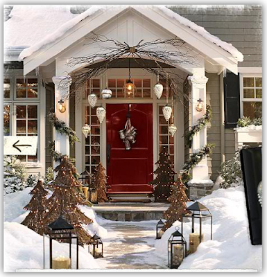
Classic white picket fence entrance!

[Pottery Barn Catalog] I love everything about this front entrance! Elegant and understated!

The home office my husband swoons over. (he will not be happy that I said "swoons"- just testing to see if he reads my posts)

Atypical office space- works for me!

A game room not relegated to the basement! How nice, all that natural light! Although, the reason I have this in my file, is the wall display. I like how the television just blends with adjacent black framed artwork.


Friday, December 17, 2010

Fun Friday Find: Teaspoons & Tea Towels

Bee's knees logo tea towel.
http://www.etsy.com/shop/macherefinery

Another Fun Friday Find straight from Etsy. For those not familiar with Etsy, it's an online community (store if you will) for buying and selling handmade items. Their mission is to enable people to make a living making things, and to reconnect makers with buyers. That is something I whole-heartedly support! 


Fun retro flower design. Illustration by artist Brandi Powell. 
http://www.etsy.com/shop/sweetharvey

Tea with a twist!
http://www.etsy.com/shop/giftzbykaren
Moka Express
http://www.etsy.com/shop/mengseldesign

Custom coffee and espresso spoons.
http://www.etsy.com/shop/sycamorehill
Whimsical peacock design!
http://www.etsy.com/shop/currykaydesigns
Vintage silver spoon garden markers.
http://www.etsy.com/shop/magpiedesignz

If you have the time check out Etsy. I have an Etsy store but I am not selling anything there... yet. I'll let you know when its up and running. First things first! 
Have a great weekend! 
Michelle


Monday, December 13, 2010

Three Design-Related Books That I Adore

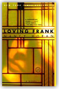
LOVING FRANK By Nancy Horan 
 Advance praise for Loving Frank: “Loving Frank is one of those novels that takes over your life. It’s mesmerizing and fascinating–filled with complex characters, deep passions, tactile descriptions of astonishing architecture, and the colorful immediacy of daily life a hundred years ago–all gathered into a story that unfolds with riveting urgency.”–Lauren Belfer, author of City of Light.
“I admire this novel, adore this novel, for so many reasons: The intelligence and lyricism of the prose. The attention to period detail. The epic proportions of this most fascinating love story. Mamah Cheney has been in my head and heart and soul since reading this book; I doubt she’ll ever leave.”–Elizabeth Berg

GREEN THOUGHTS By Eleanor Perenyi 
You do not have to be a good gardener to fall in love with Green Thoughts. It reads with the intrepid assurance of a classic. Mary McCarthyThe New York Review of Books


Unlike any other gardening book I know, with its Old World charm, its down-to-earth practicality, its whimsy and sophistication. Brooke AstorThe New York Times Book Review

One of those dangerous reference works that you reach for at a moment of horticultural crisis or indecision only to find yourself an hour later browsing far beyond the page where you began. The New Yorker -- Review


THE ARCHITECTURE OF HAPPINESS By Alain de Botton


From the back cover: The Architecture of Happiness is a dazzling and generously illustrated journey through the philosophy and psychology of architecture and the indelible connection between our identities and our locations. One of the great but often unmentioned causes of both happiness and misery is the quality of our environment: the kinds of walls, chairs, buildings, and streets that surround us. And yet a concern for architecture is too often described as frivolous, even self-indulgent. Alain de Botton starts from the idea that where we are heavily influences who we can be, and argues that it is architecture's task to stand as an eloquent reminder of our full potential. 

Friday, December 10, 2010

Fun Friday Find

I'm not sure why, but I just love these vinyl decals by Popwall. The trees, the branches and the birds can be configured however you want them. I love them so much I bought one for someone on my Christmas list! There are many patterns to choose from but I guess it's the linear pattern that these create that I find so appealing.


To add a touch of whimsy to one of your rooms visit: http://www.etsy.com/shop/NouWall?ref=top_trail
for all of the details, these are about $70.

Have a great Weekend,
Michelle

Tuesday, December 7, 2010

A Blue Christmas for the Dining Room

All photos in this post by Michelle Samoraj of Ispirato Design
Walls: Benjamin and Moore: Palace Dining Room Pearl-Blue, Everard Dining Room Cream

Not your typical Red and Green color scheme! The blue walls in this dining room, that I designed, were the inspiration and the starting point for the Christmas decor. When people see this room I want them to say "whoa, that's a lot of blue" (but not too much- I believe you have to strike a balance...I'm going for "understated" not "over the top"). 

Displayed on the buffet is an all white porcelain nativity by Lenox. I gathered several blue and white pieces, that belong to the homeowner, and arranged them on an antique table between the windows. The mini Christmas tree is "planted" in a concrete vase brought in from the garden and adorns blue and white lights and a collection of bird ornaments.
One corner of the dining room is reserved for the telephone and a place to drop the mail. The Christmas cactus is blooming right on schedule... But what is going on with the centerpiece!?
Below is a picture of the off-white, painted dining room table. The blue, blown glass vase with some fresh flowers (i'm thinking white roses with some holly) is what I would like to use for a centerpiece. I would love a beautiful mirrored or silver tray but the tray shown is what is available.
I would like to use a tray under this blown glass vase but this tray just doesn't work. Obviously, I could buy something, but when your working on a budget you have to be creative! 
Voila, a new tray!

Click here to visit Ispirato Design Marketplace  where I show how I transformed this tray into something that will compliment the decor of this dining room. 

Monday, November 29, 2010

"Design is a plan for arranging elements in such a way as best to accomplish a particular purpose." Charles Eames

From this quote you would think he was a function over form guy but definitely not...have you seen his furniture designs! 


I know it's not for everyone but I love this!
http://en.wikipedia.org/wiki/Eames_Lounge_Chair,

Wouldn't this make your office happy!?


Decorating For The Holidays

traditionalhome.com

I opened up the boxes of Christmas decorations over the weekend and found the little snapshots that I tucked into each box last year so that I would remember how I decorated. I forgot that I did this but I do remember why. My thinking was that if I could just remember from year to year where everything went, then decorating would be quick and easy! I like to entertain at the holidays, my oldest son was born on Christmas and I have another son with a New Years Eve birthday so I have a lot of stuff and I really do it up. Besides, I'm sentimental and I'm  a collector...did I mention that I have a lot of stuff and even more excuses for having so much stuff!

Do you decorate the same every year or do you mix it up? I remember we got into this subject at a book club  meeting once. Some intentionally did not do the same year to year, some did what I did and took pictures (that's probably where I got the idea) and others had no plan...just put things wherever (obviously not afflicted with the "every detail needs to be designed curse").

Well, so much for the plan. It took all of two seconds to dump the plan and start with fresh eyes. That's how design goes. We change, what we like changes, we are inspired along the way by new ideas, new experiences and new places. I'll probably take pictures again this year but next year I really hope I will feel inspired enough to change it all again.    

Here are some ideas from Traditional Home Magazine that I have found inspiring for this year! 
A beautiful way to add a festive touch to a potted plant. I like using gold painted pine cones. 

I love how the bust was adorned with a crown...details, details!


This photograph and the one below have inspired me to incorporate pine cones (that I will probably paint gold), some berries and my own bird ornaments into my chandelier design this year.


The powder room is used more than ever during the holidays. Scented decorations are a nice touch!

So simple... repetition always makes a statement!
I hope you were able to find some inspiration here, Happy Decorating! 

Tuesday, November 16, 2010

Ornamental Kale: A Fall Beauty in the Garden

Okay that's it... I am planting these next spring! Is anyone else in awe of these stunning fall beauties? Around CNY, this time of year, Ornamental Kale is one of the few plants in the garden still putting on a show but you have to have enough foresight in the spring to plant them! 


I think fall is a good time to look around your landscape and actually take notes or make a list for the following spring. What do you want to remember to plant? Is your landscape as interesting in the fall as it is in the spring and summer? What do you need to plant in the spring to extend the beauty of your landscape well into the cool months of autumn? When spring finally does roll around we want instant gratification! NEXT SPRING when your at the nursery comparing beautiful plants about to burst into bloom and scraggly little purple stems with a couple of leaves..... THINK FALL! 

Monday, November 1, 2010

A New Endeavor

I believe that everyone is blessed with a gift from God and it is our duty to discover what that gift is and nurture it so that we may share it with the world around us. I truly believe this and that is why I have a sign in my work space that says "Design Something!" I actually do feel guilty when I am not designing or creating something.  Why?  Because I can.

This blog will be two things: First, a collection of everything that inspires me and that I hope will inspire you:  Architecture, Nature, Books, Family, Philosophy and Art. Second, it will be a portfolio of work that I have done and am currently working on.  I would like to showcase not only my own products but those that I tear out of catalogs and magazines  and put up on my bulletin board to remember that I want it or I want to create something like it! I do that a lot and I always encourage my clients to do it. It's a very useful tool. (Hey, I should blog about that!)

I'm very excited to get started.  Thank you for reading my first post and I hope this is the beginning of many new encounters.

I would love to hear your comments or answer any questions that you might have along the way.
Michelle